Data Visualization Guidelines
The goal
Create user-centric data visualization guidelines that could be leveraged by developers, designers, and decision makers at a Fortune 500 company.
Who’s the audience?
Methods used:
User interviews, Comparative analysis, and Wireframing
In order for us to ensure that these guidelines were created in a way that many different types of users could leverage them, we needed to understand our audience. And although designers like myself were part of the audience, we also needed to understand the perspectives of developers creating the data visualizations and the ultimate consumers of the data visualizations.
Putting together the content
Tools Used:
Adobe XD
Once we understood who could use a site like this, we set out to research all of the best practices that were already out there and how we could adapt them to meet our company’s internal needs. We specifically referenced the following guidelines:
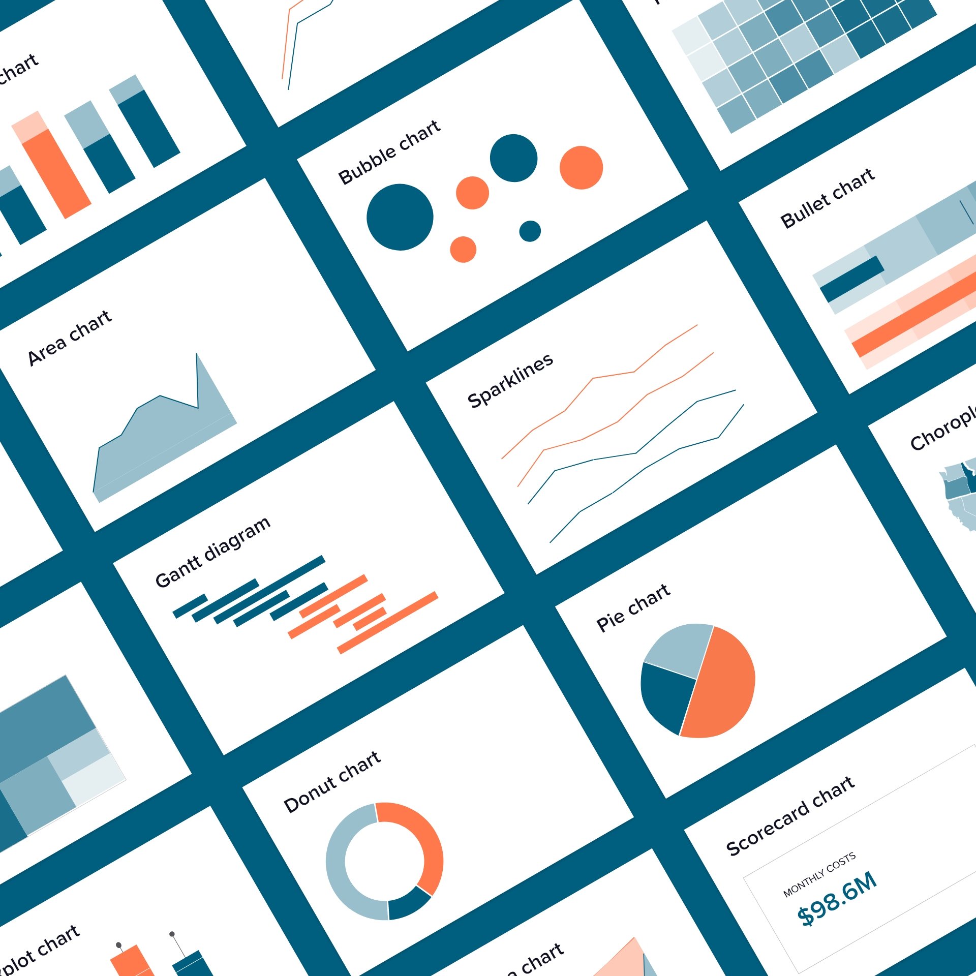
In the end we created a website full of guidance on data visualization fundamentals, use of color and typography, accessibility, dashboards, and more.
