World Religion Data Visualizations
Our challenge
Present the number of major religion adherents in a way that would be meaningful to a broad target audience. We set out to portray how these religions have evolved over time around the world.
Infographic Visualization
Tools used:
Excel, RStudio, and Illustrator
As a team, me and one other designer created this visualization by focusing on Stephen Kosslyn's goals of information visualization:
Connecting with the audience
Hold the audience's attention
Promote memory and understanding
We brainstormed how to relate the large dataset to a broad audience. We sketched out several ideas of how to manipulate the data and present it effectively.
Once we agreed on an overall concept of the infographic then we created our initial visualizations in RStudio. Next, we cleaned up all the data in Illustrator. It was this step where we were able to encode color to the data to bring aboutdeeper understanding of the information. We also used a fairly simple layout with lots of white space to capture the audience's attention.

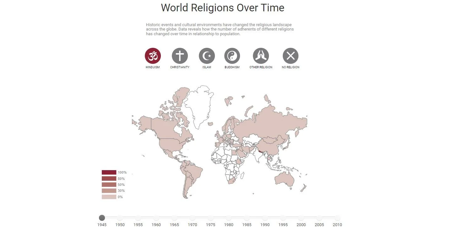
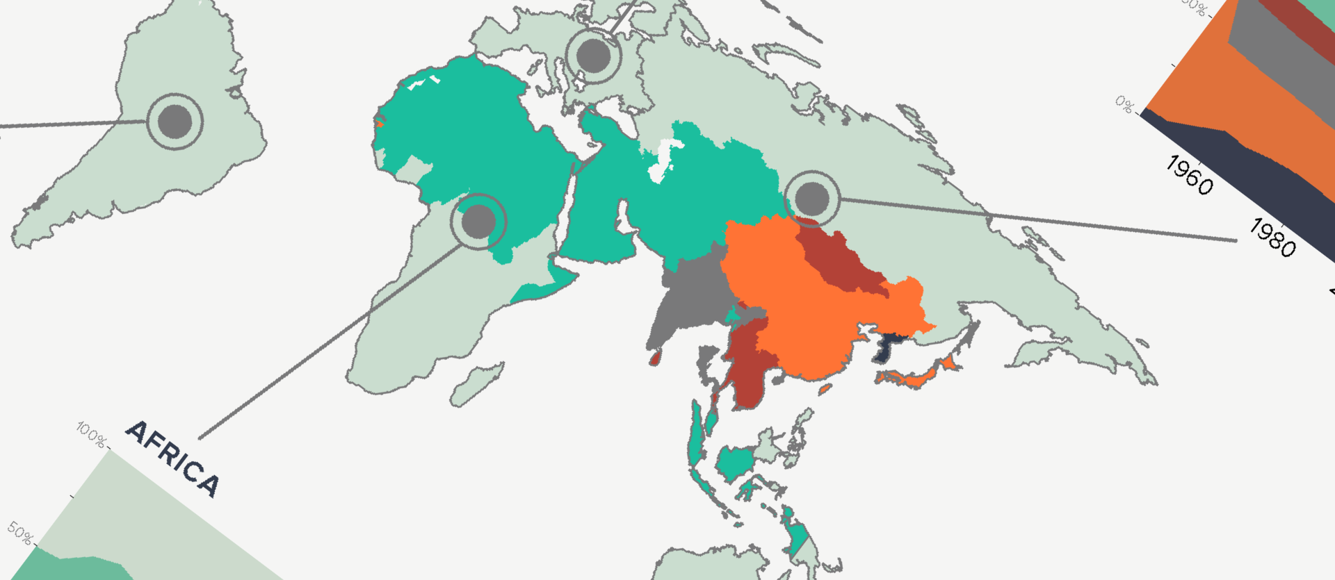
Interactive Visualization
Tools Used:
HTML, CSS, d3.js, and Bootstrap.js
After completing the printable infographic about World Religions, we wanted to take it a step further. We wanted to empower the audience to learn even more about the subject by interacting with the data. I used d3.js to create an interactive map of the different world religions over time.